Table of Contents
Plots
A variety of plots are available in ADCI software. Dose estimation automatically generates a plot upon execution, while the other plots are generated upon request.
Zoom and pan functionality
Feature present since ADCI version 1.9
Zoom
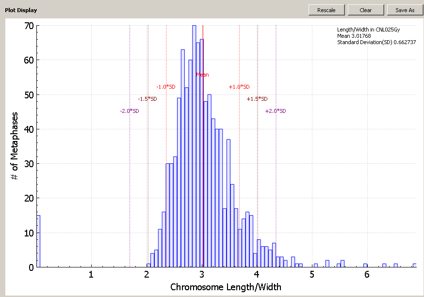
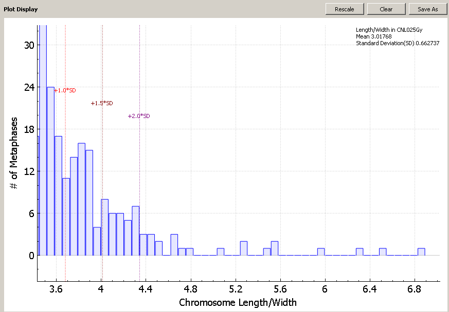
Zoom in and out using the mouse wheel. Note the zoom functionality zooms in on both the x and y axis. Plot axes are rescaled as necessarily while zooming. The default level of zoom ensures all data points are contained within the visible area (viewport). After zooming, please note some datapoints may be present outside the field of view. For example, the two screenshots to the right of this text depict default zoom (upper screenshot) and increased zoom (lower screenshot). The leftmost bar in the lower screenshot extends beyond the top of the plot viewport.
Pan
The plot viewport can be moved without altering the zoom level in a “drag and drop” manner by holding down the mouse button and moving the mouse. When the mouse button is held down, moving the mouse in any direction will move the viewport. When attempting to click and hold the mouse button to begin panning, ensure the cursor is within the boundaries of the plot. Attempting to pan while the cursor is outside of the plot viewport will cause the window itself to be moved instead. If this occurs it may cause the plot area to “pop out” of the main ADCI window and become a separate window. It can be reattached by simply dragging the plot area back into position in the main ADCI window.
Rescale to default position
Click the “Rescale” button above the plot viewport to reset the zoom level and pan position to default.
Plot types
Calibration curve
Plot generation
Highlight a calibration curve within the main GUI and click the ![]() icon. Multiple curves can be plotted simultaneously. A color can be assigned to a curve by highlighting the appropriate curve, selecting a color from the color dropdown list in the Curves section within the main GUI, and clicking the
icon. Multiple curves can be plotted simultaneously. A color can be assigned to a curve by highlighting the appropriate curve, selecting a color from the color dropdown list in the Curves section within the main GUI, and clicking the ![]() icon.
icon.
Plot description
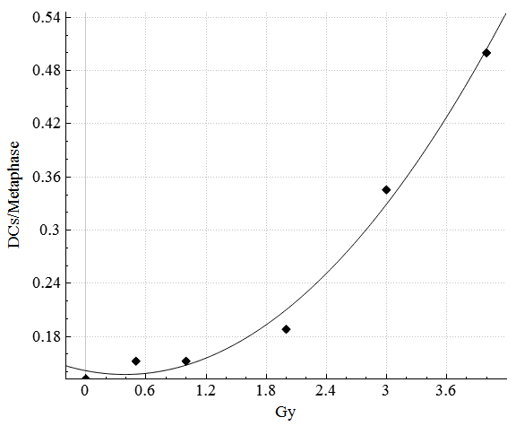
- x-axis
Radiation exposure in gray (Gy) - y-axis
Number of DCs per image
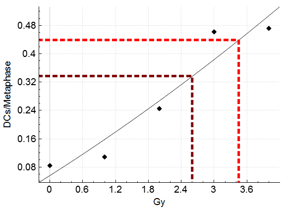
The curved line represents the value (in Gy) which will be assigned to a sample during dose estimation based on its calculated DC frequency. A diamond (♦) symbol is present for each calibration sample, based on calculated DC frequency and the physical dose input during calibration curve creation. If curve confidence intervals are shown (see the calibration curve page for more details), upper and lower 95% confidence intervals appear as dashed lines above and below the curve.
Dose estimation
Plot generation
This plot will appear when the dose estimation process is complete.
Plot description
- x-axis
Radiation exposure in gray (Gy) - y-axis
Dicentric chromosomes per metaphase images - dotted lines
Each dotted line represents a DC frequency input in the Dose Calculator.
Each DC frequency (dotted line) is colored differently. To determine which DC frequency a dotted line corresponds to, consult the output appearing in the console.
Distribution of detected DCs in Sample
Plot generation
Highlight a single sample within the main GUI and click the ![]() icon.
icon.
Plot description
- x-axis
Number of dicentric chromosomes - y-axis
Frequency of metaphase images
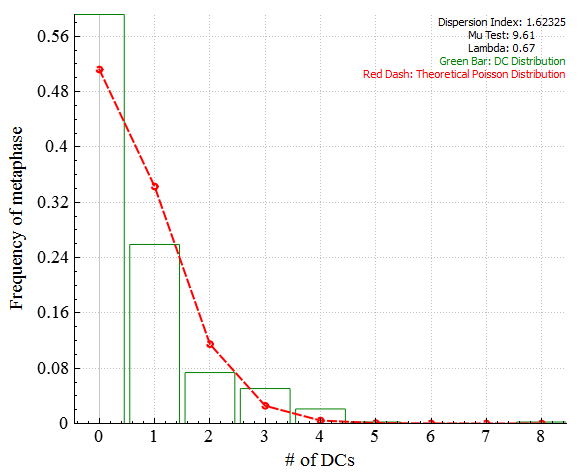
Green bars represent the frequency at which DCs appear in metaphase images in the sample. In this example, ~26% of images in the sample contain 1 DC. The Red dashed line represents the theoretical Poisson distribution (probability of a number of independent events occurring in a fixed time interval).
The dicentric cell distribution under full body X or gamma ray radiation is expected to form a Poisson distribution. Dispersion index and Mu test are used to test this compliance. For a Poisson distribution, the dispersion index is one. Mu test higher than 1.96 indicates over-dispersion. Mu test lower than -1.96 means under-dispersion, which is likely to indicate problems in data sampling. The theoretical Poisson distribution with the average number of DCs as Lambda is the result of fitting a Poisson distribution to the actual DC distribution using maximum likelihood estimation. The chi-square goodness of fit is calculated for the Poisson and the actual DC distribution. The result is the p-value of the hypothesis that the DC distribution comes from the Poisson distribution.
Dicentric cell distribution will have only one bin for cells with no DC and the p-value will be 'nan', not-a-number, if no DC is detected in the sample. It might be caused by a sigma value that is too small, too few images in the sample, or a low exposure dose of the sample.
Distribution of filtering stats for sample
Highlight a single sample and click the ![]() icon to show information for a specific filtering stats. See the Image selection model page for explanations of image filtering/selecting stats.
icon to show information for a specific filtering stats. See the Image selection model page for explanations of image filtering/selecting stats.
Number of objects
Plot generation
Highlight a single sample within the main GUI, click the ![]() icon, and select “Number of objects” from the dropdown.
icon, and select “Number of objects” from the dropdown.
Plot description
- x-axis
Number of objects - y-axis
Number of metaphase images
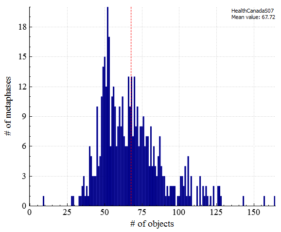
# of objects is the total number of objects found in an image, excluding noise and nuclei. Ideally, the object count would be 46. The plot visualizes how frequent each object count is within a sample.
Mean chromosome length/width ratio
Plot generation
Highlight a single sample within the main GUI, click the ![]() icon, and select “Mean chromosome length/width radio” from the dropdown.
icon, and select “Mean chromosome length/width radio” from the dropdown.
Plot description
- x-axis
Chromosome length-width ratio - y-axis
Number of metaphase images
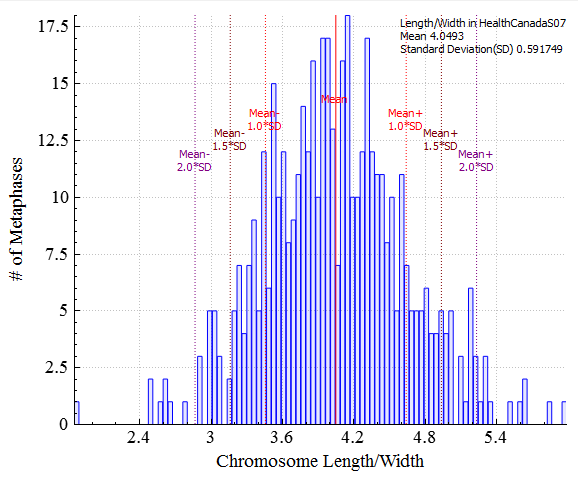
Chromosome length-width ratio is the average length-width ratio of all chromosomes in an image. ADCI software works best with chromosomes which are not too long, or too thin.
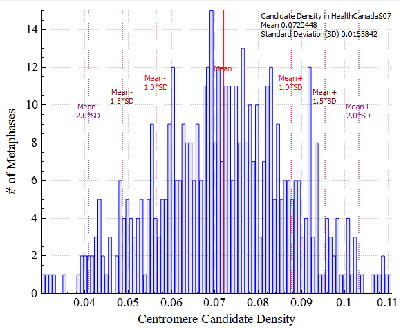
Mean candidate density
Plot generation
Highlight a single sample within the main GUI, click the ![]() icon, and select “Mean candidate density” from the dropdown.
icon, and select “Mean candidate density” from the dropdown.
Plot description
- x-axis
Centromere candidate density - y-axis
Number of metaphase images
Centromere candidate density represents average bending level of chromosomes in an image. Severely bent chromosomes generally reduce the accuracy of DC detection.
Mean Chromosome finite difference
Plot generation
Highlight a single sample within the main GUI, click the ![]() icon, and select “Mean Chromosome finite difference” from the dropdown.
icon, and select “Mean Chromosome finite difference” from the dropdown.
Plot description
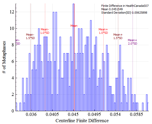
- x-axis
Centerline finite difference - y-axis
Number of metaphase images
Represents the average concavity level of chromosomes in an image. Chromosomes showing insufficient centromere constriction generally reduce the accuracy of DC detection.
Number of segmented objects
Plot generation
Highlight a single sample within the main GUI, click the ![]() icon, and select “Number of segmented objects” from the dropdown.
icon, and select “Number of segmented objects” from the dropdown.
Plot description
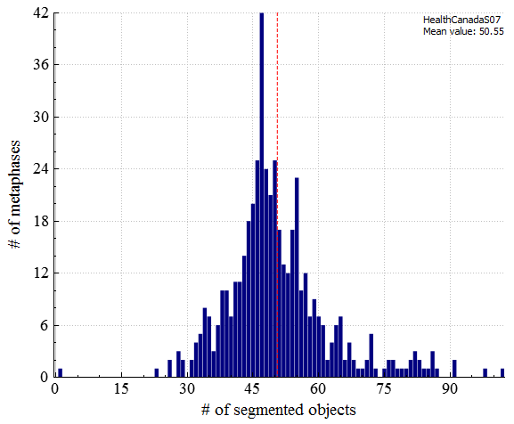
- x-axis
Number of segmented objects - y-axis
Frequency of metaphase images
The number of objects processed by GVF algorithm in an image. Segmented objects (processed by GVF) are a subset of total objects. Ideally, it would also be 46. It is similar to object count, but more stringent.
Classified object/segmented objects
Plot generation
Highlight a single sample within the main GUI, click the ![]() icon, and select “Classified object/segmented objects” from the dropdown.
icon, and select “Classified object/segmented objects” from the dropdown.
Plot description
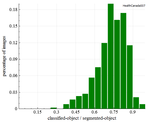
- x-axis
Classified object/segmented object ratio - y-axis
Percentage of metaphase images
The ratio of objects recognized as chromosomes and segmented objects. Classified objects (recognized as chromosomes) are subset of segmented objects.
Group bin distance
Plot generation
Highlight a single sample within the main GUI, click the ![]() icon, and select “Group bin distance” from the dropdown.
icon, and select “Group bin distance” from the dropdown.
Plot description
- x-axis
Sample(s) in the plot - y-axis
Group bin distance
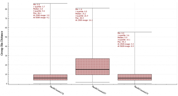
This plot is a whisker box graph demonstrating statistics of metaphase image group bin distances in sample(s). A box shows positions of the first quartile, the median and the third quartile of group bin distances in a sample. The two whiskers indicate the minimum and maximum. Text boxes display the numerical values of these stats, as well as group bin distances of the 250th image and the 500th image sorted in ascending order of group bin distances, if applicable. Multiple samples can be plotted together for comparison. If the current plot is not a group bin distance plot, it will erased and the new whisker box will be drawn. If the the current plot is a group bin distance plot, the new whisker box will be drawn as the rightmost box.
